Mapping
Design Challenge:
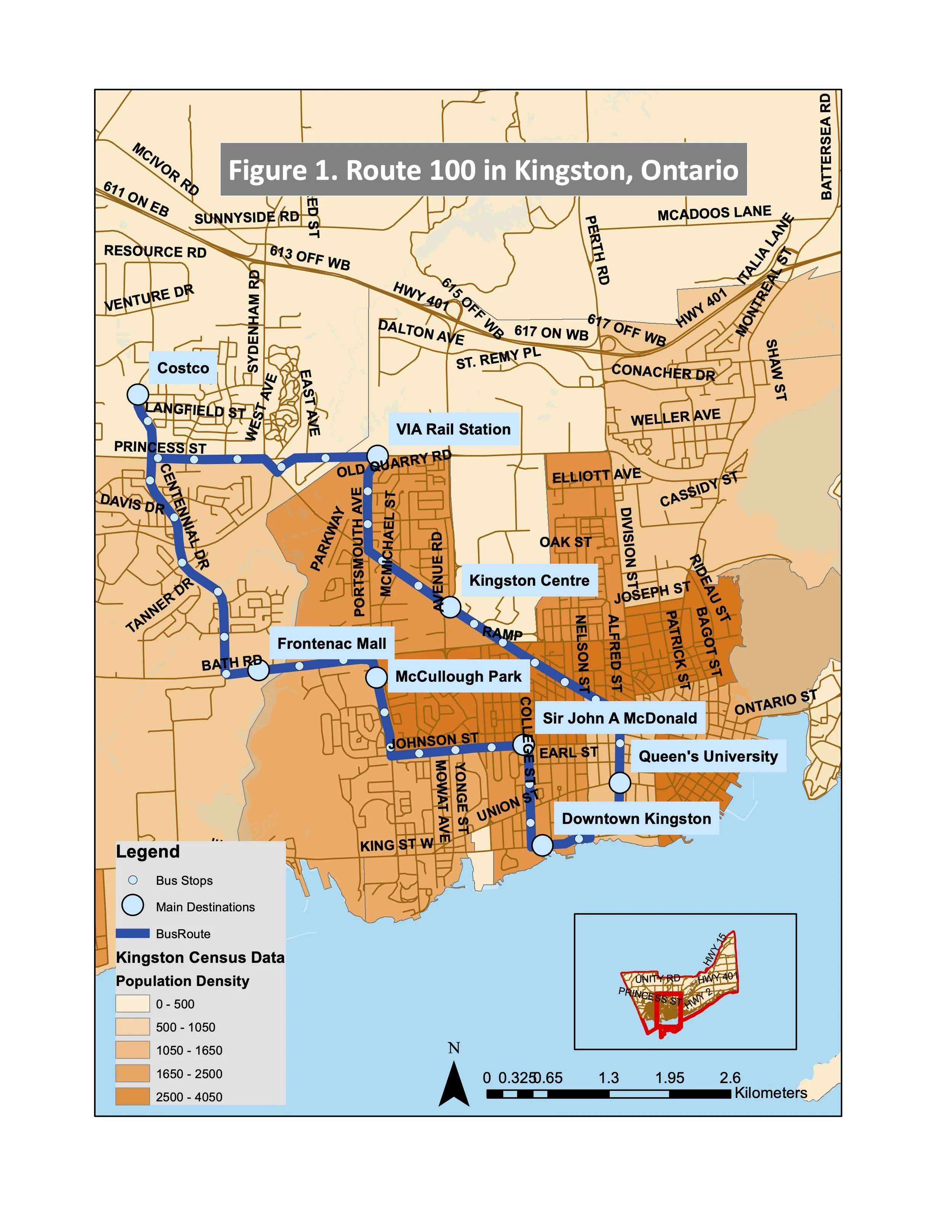
Kingston residents rely on the public transportation system to access key destinations throughout the city. The proposed Route 100 aims to connect major hubs such as Queen’s University, Downtown Kingston, VIA Rail, Costco, Frontenac Mall, McCullough Park, and Sir John A. Macdonald Boulevard to less populated areas. The route was developed by analyzing population density, housing density, and road segments without existing bus service to determine the most optimal connection.
Tool: ArcGIS
Outcomes:
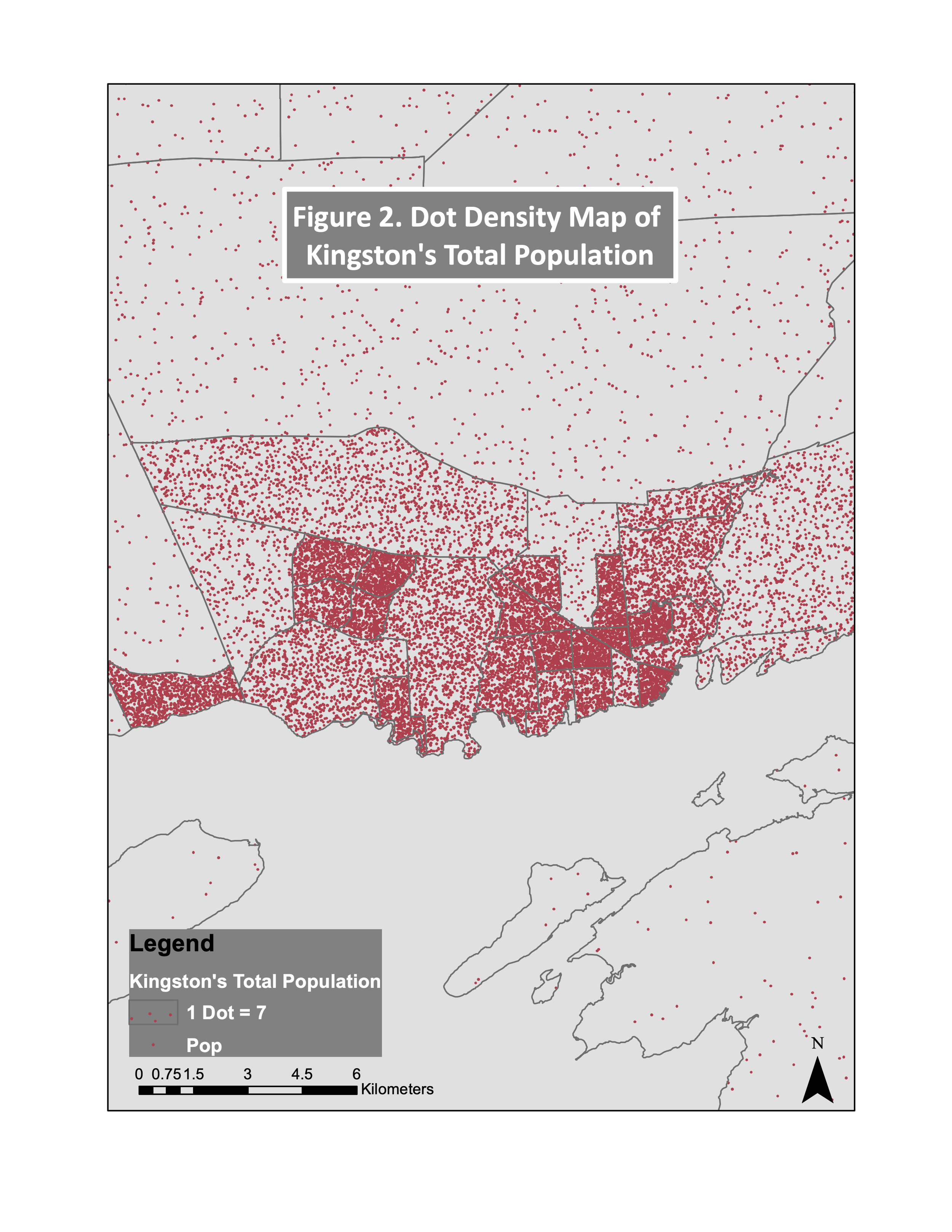
Figure 2. The Dot Density Map represents seven people per dot, illustrating a higher concentration of residents in the city centre compared to suburban areas.
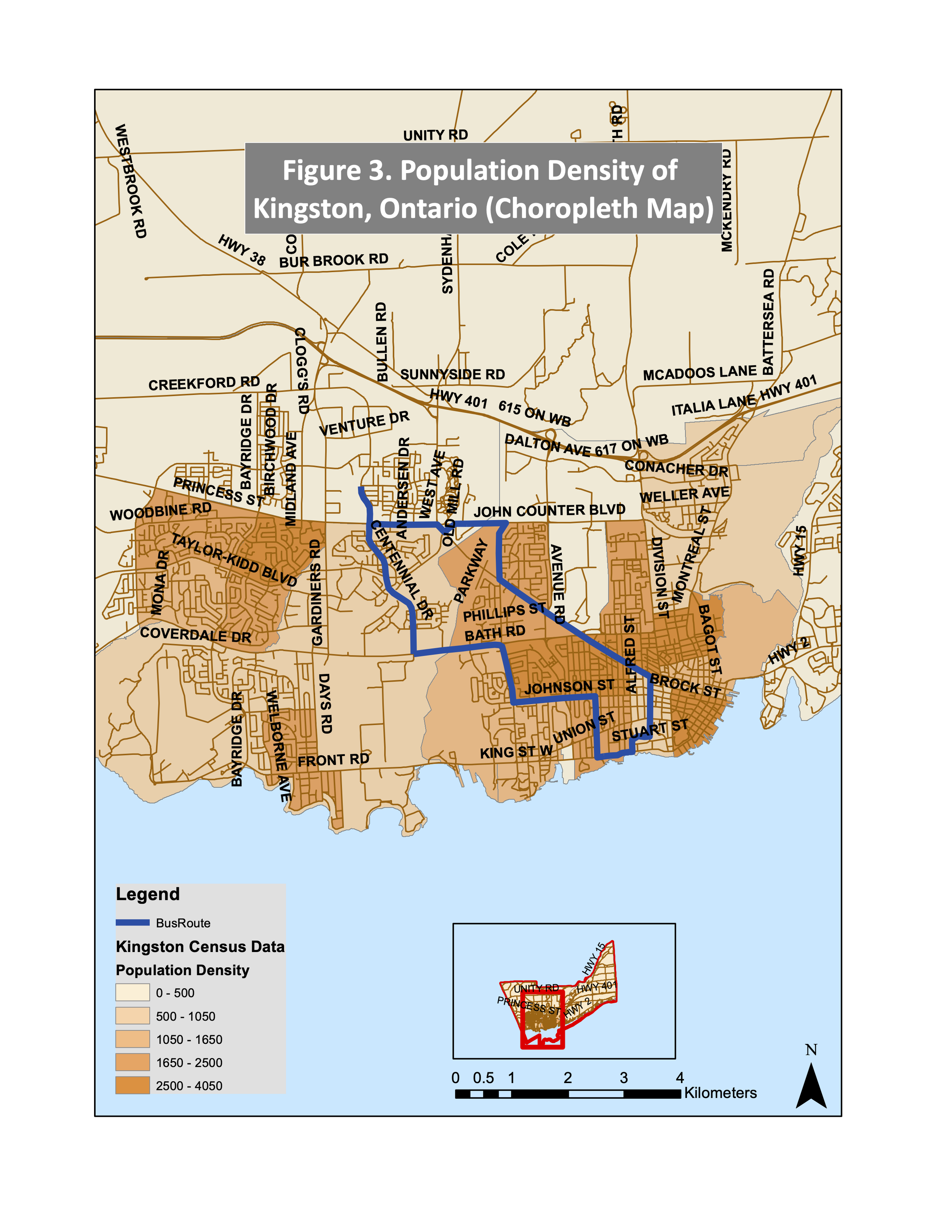
Figures 3 and 4. Choropleth maps allow users to visualize the density of the City of Kingston. Figure 3 displays total population per square kilometre. Darker orange tones indicate high population density, medium hues indicate moderate density, and lighter shades represent low density. Figure 4 illustrates residential density, calculated by dividing the number of dwellings by area (per square kilometre). Dark pink areas represent higher dwelling density, while lighter shades indicate lower density.
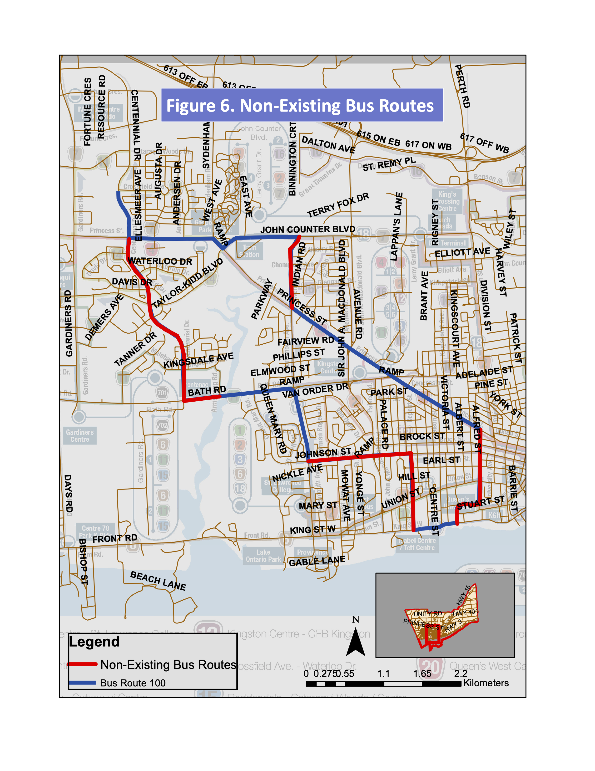
Figure 5 and 6: Figure 5 presents the proposed Route 100, while Figure 6 highlights roads without existing transit services (shown in red).
Together, these figures demonstrate how the proposed route addresses service gaps and improves connectivity to underserved areas.